When opening a new Presentation, start by selecting the desired theme, the device type (desktop, tablet, or mobile), and the layout (fixed, tiled, or tooltip).
These preferences can be changed later on, when working on the presentation.
Choose Theme
Select a design theme (green highlight below); this can be changed later from the Design ribbon.
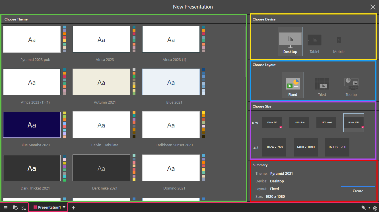
Choose Device
The device type (yellow highlight above) can later be changed from the canvas menu.
- Desktop: select Desktop to optimize your presentation for desktop.
- Tablet: if you intend to share or present your slides via tablet, choose this option to ensure the slide size is optimized for tablet use.
- Mobile: choose this option to build a presentation specifically for mobile viewing, enabling miniature visuals, text, buttons, and dynamic assets (dynamic images, dynamic text, dynamic URLs, and dynamic jump buttons).
Choose Layout
Select a fixed, tiled, or tooltip layout (blue highlight):
- Fixed: a plain layout, with a grid that can be disabled. Visualizations can be placed anywhere on the canvas. Toggle the grid on and off from the Design ribbon.
- Tiled: a tiled layout, the visualizations can only be placed along the tile lines. The tiles cannot be disabled.
- Tooltip: a streamlined layout optimized for tooltip actions. The maximum size is 500 x 500 pixels. The navigation, menus, and master pages are removed.
Choose Size
Select the required canvas size from the presets (purple highlight). This can be changed later from the Design ribbon if needed. The options are:
4:3 aspect ratio - Designed for older computer monitors
- 1024 x 768
- 1400 x 1080
- 1600 x 1200
16:9 aspect ratio - Designed for HD and wide-screen displays
- 1280 x 720
- 1440 x 810
- 1600 x 900
- 1920 x 1080
Summary
The Summary panel (red highlight) displays your selected theme, device, layout, and size. Click Create to build the new presentation.